StayFresh
An MVP built for grooming consistency and ease.

Timeline
June 2025 - July 2025
Role
UX/UI Designer
Freelance Project
PROJECT OVERVIEW
StayFresh is a haircut reminder app that helps users log cuts, set reminders, and track their grooming routines with ease.
I teamed up with the app’s developer to improve the “New Cut” flow, his main focus for the MVP. I explored multiple UX concepts and refined the design based on feedback, aiming for a simple, flexible experience that feels natural for first-time users.
PROBLEM
Helping users stay fresh without the friction
Making grooming routines easier, one screen at a time
While the app aimed to help users stay consistent with their grooming routines, the original user flow and UI made the experience feel confusing and incomplete. Beyond the product itself, users also face common frustrations when it comes to tracking their haircuts and staying on schedule.
Users often forget their haircut schedules or don’t know how often to cut their hair
There’s no central place to track past styles, photos, or preferred barbers
Most grooming apps focus on booking not personal tracking or reminders
To address the issues with the original flow and interface, I focused on creating a smoother, more flexible experience that supports users at every step of their grooming routine. The redesigned “New Cut” flow helps users stay consistent, log their progress, and visually track their haircut history all with less friction.
I also made significant design changes based on feedback and usability goals:
"How can we simplify the grooming process while giving users more control over their haircut history and routine?”
SOLUTION
Redesigned the UI
The old design felt flat and hard to read, so I updated the colors, fonts, and layout to make it cleaner and more modern.
Shorten the logging flow
Logging a cut took too many steps, so I streamlined it using modular screens that guide users through quickly.


RESEARCH
User Persona & Competitive Analysis

To understand how StayFresh could stand out, I looked at existing grooming and booking apps to identify gaps in the user experience
Most of the apps out there focus on booking a barber, but none really help users track their own routines. That showed me there was a real gap, people need something simple to stay on top of their cuts, not just a way to make appointments.
Key Insight from Competitive Analysis:
User Interviews
For our user interviews, we asked 4 men, including students and working professionals, all of whom get haircuts or cut their hair regularly (every 4-8 weeks). All of the participants were peers of the app owner.
Research Questions:
How do you currently remember your last haircut?
What tools or apps do you use to manage grooming routines?
How often do you want to be reminded about haircuts?
INSIGHTS
Main Insights
Haircuts are mostly based on gut feeling. Most said they wait until their hair “feels too long” or someone mentions it.
No one uses a dedicated grooming app. A few use calendar apps or rely on barbers to remind them, but nothing consistent.
A visual history would be useful. Several mentioned struggling to describe or recreate a past cut and said having photos would help.
The interviews made it clear: users want something simple, not overwhelming. Most rely on memory or guesswork, and no one had a reliable system for tracking their cuts. These conversations helped me focus the app around ease, flexibility, and giving users more control over their grooming routines without adding friction.
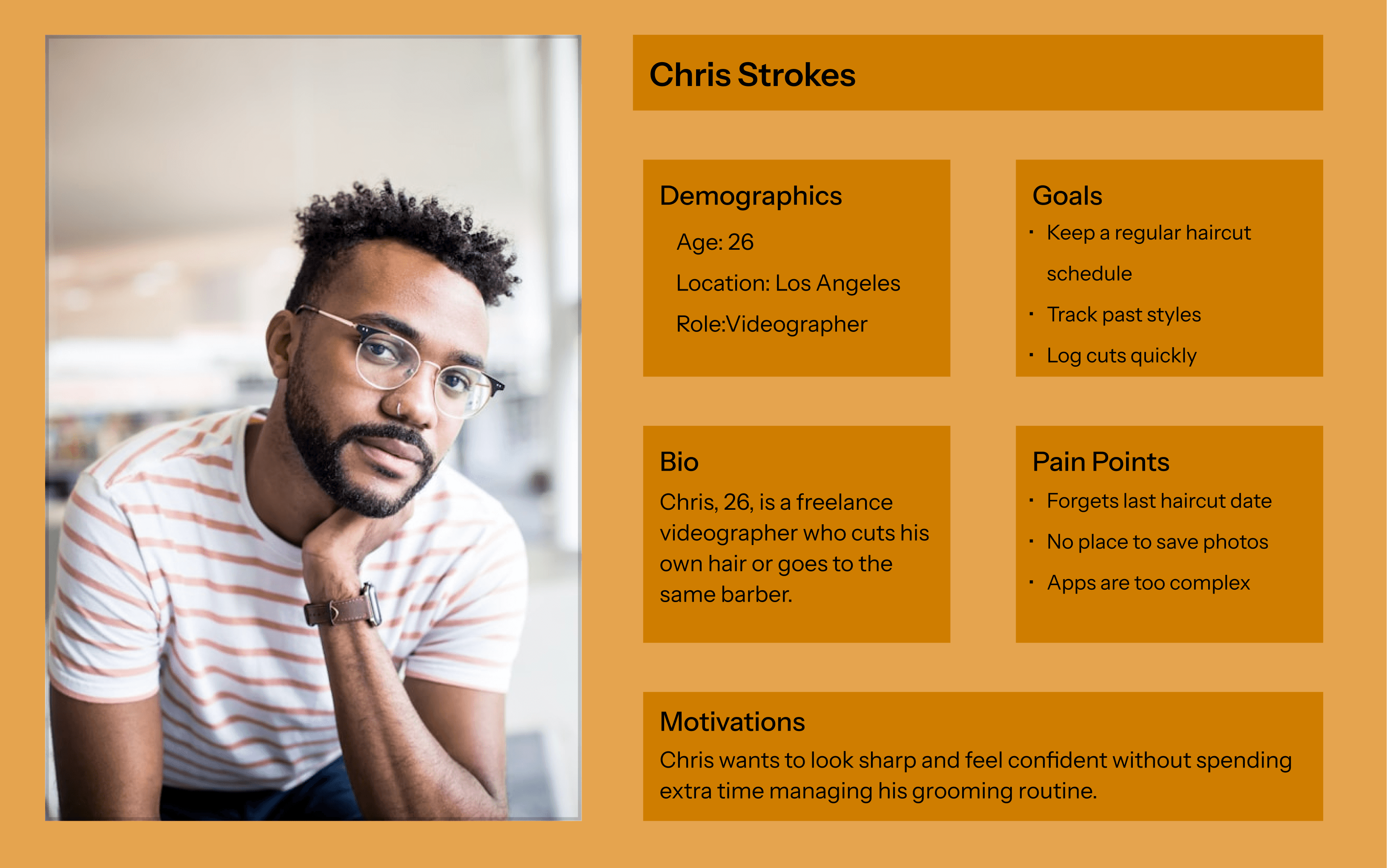
USER PERSONA
DESIGN
Exploring Flexible Ways to Log a New Cut
To improve the “New Cut” flow, I pitched three distinct design concepts each offering users flexibility and control while balancing simplicity and detail.
Users see all steps up front as a list with toggles. They can choose what to include or just use Quick Add to log a cut fast.
Pros
+ Quick and simple
+ Customizable based on user preference
+ Familiar interaction pattern
Cons
- Less visually engaging
- Could feel too task-oriented
Users move through each step one at a time, with skip buttons for anything they don’t want to fill out.
Pros
+ Easy to follow, especially for new users
+ Clear and focused experience
+ Encourages completion without pressure
Cons
- Slower for returning users
- Requires more taps/screens
All steps are displayed as cards. Users can tap any section to fill it in or skip everything with Quick Add.
Pros
+ Visually flexible and modern
+ Lets users move at their own pace
+ Encourages exploration
Cons
- Can feel unstructured
- Might be overwhelming on smaller screens
Checklist
01.
Guided Step
02.
Card Style
03.


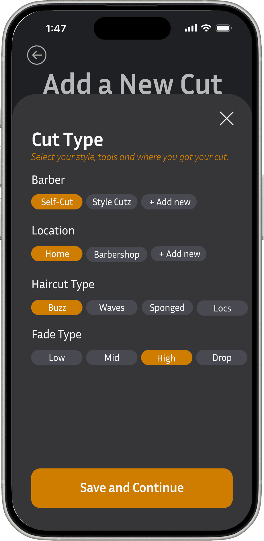
Final Direction: Card Style + Modular Flow
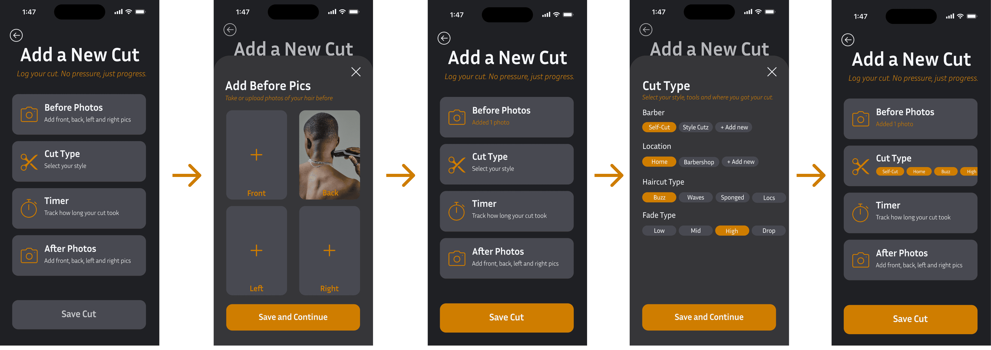
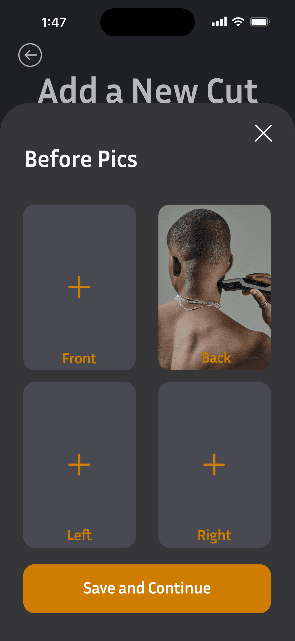
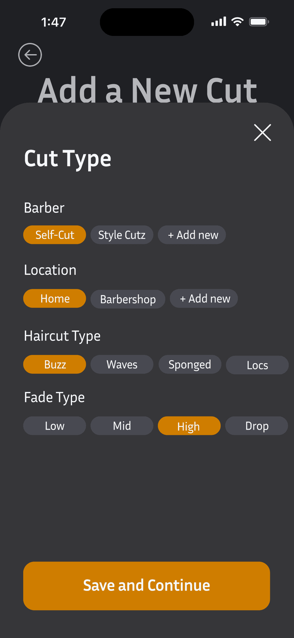
We chose the Card Style layout with a modular input flow. Users see four cards and tap only the ones they want to fill out, everything is optional.
Tapping a card opens a focused screen for that input. Once done, users return to the card view with feedback showing it’s complete.
This approach keeps the flow simple, flexible, and user-friendly without forcing a specific order or extra steps.

TESTING & IMPROVEMENTS
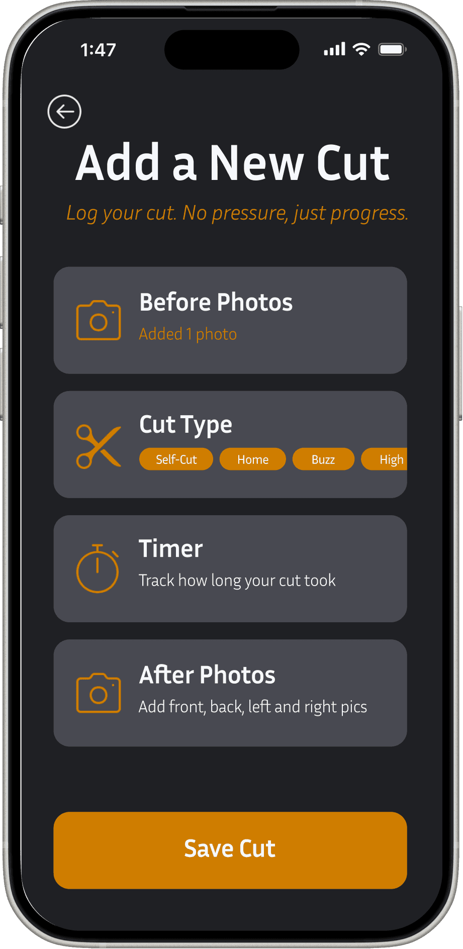
Based on feedback from the app developer, I made several updates to simplify and streamline the flow:
Added view past cuts
Kept timer visible during logging
Combined before/after photo into one step
Made modular screens full screen
These changes made the experience cleaner, faster, and easier to use.
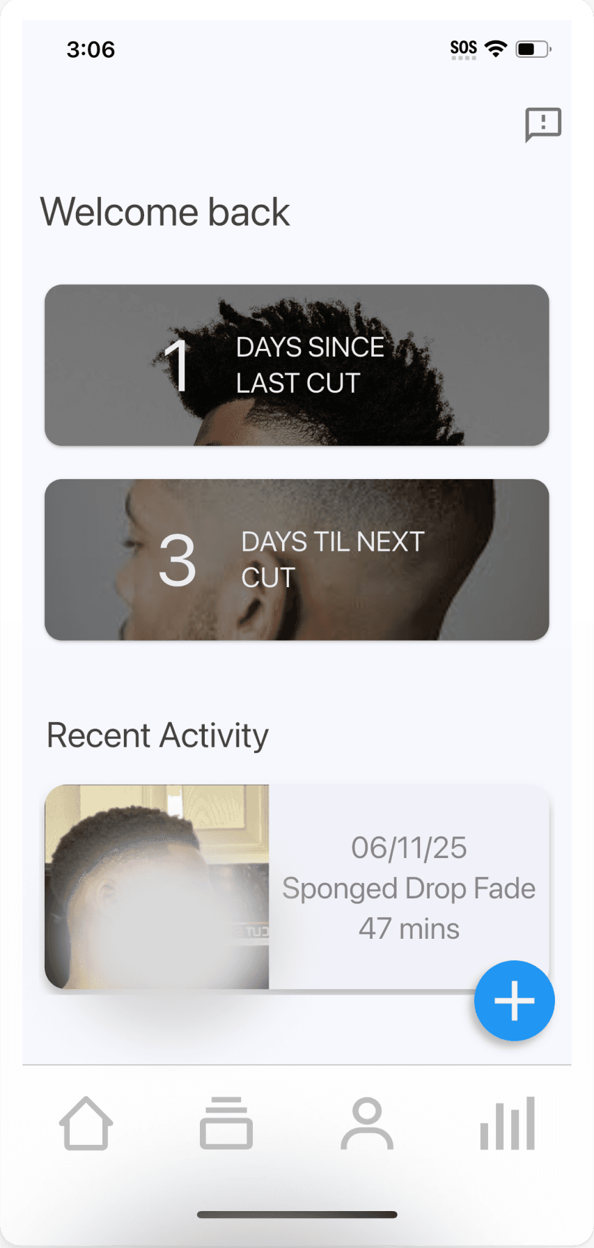
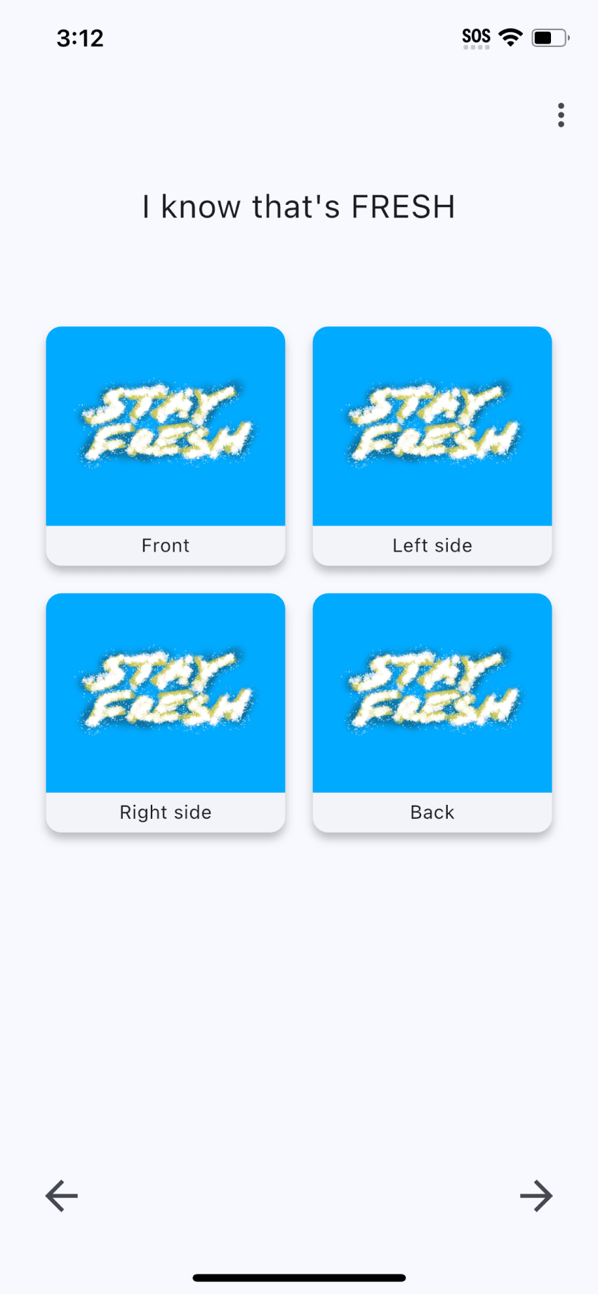
FINAL PRODUCT
Here are some of the key pages:


Colors
Typography
Button
Icons
#F5F7FB
#CF7D00
#484951
#1F2024
#F2F2F2
#000000
Semibold
Regular
Aa Bb Cc Dd Ee Ff Gg Hh Ii Jj Kk Ll Mm Nn Oo Pp Qq Rr Ss Tt Uu Vv Ww Xx Yy Zz
Light
Inria Sans


CONCLUSION / LESSONS LEARNED
Conclusion
What Went Well:
Modular design accommodated diverse user needs
Strong collaboration with engineering streamlined MVP development
What I’d Do Differently:
1) Incorporate user onboarding flows to better guide first-time users and improve retention
2) Include a feedback loop within the app for ongoing user suggestions and improvements

UI DESIGN